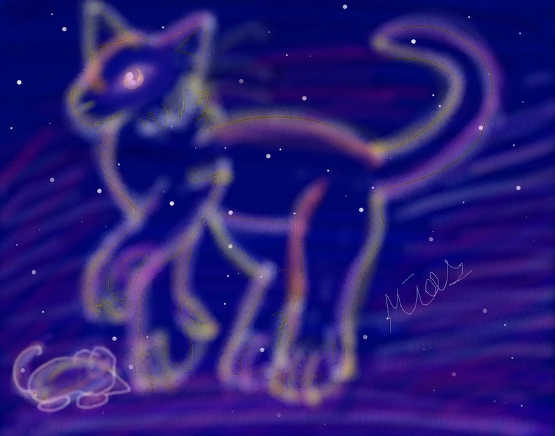
First of all, you have some very smooth lines, especially considering you're working with a mouse. I'm sure these took ages. Given that you have limited equipment, I'm going to try and keep my advice pretty general.
I apologize in advance if anything I go on about with the star cat are things you're already planning to correct. Hopefully what I have to say will help with the clean up.
I think if I were to critique anything about the pose, it would be the direction of the cat's eye. The pupil is facing us. I think if you were to have the pupil pointing to the mouse, it would feel more like a scene.
The outline is a little hard to look at. It's mainly the texture. The fuzzy glow needs to have a sharp outline to keep it from mixing into the background. I see you still have some dark outlines in there, but they're hard to see. The mouse's white outlines work really well here.
I really do love the colors blended into the cat. I will only say, don't be afraid to ramp up the brightness. You really want that cat to pop against the dark background, (without clashing of course.)
The snail is my personal favorite of the set. The colors you chose really go well together, and I love the shapes you used. The perspective is also pretty well done.
The big thing here is contrast. I picked out the colors, and I noticed you used the brightest possible pink. The problem is now when you go to get the white highlight, it's not actually all that brighter. In fact, it looks almost grayed out.
I'd recommend getting darker with your base colors. That way, you can really get the highlights to stand out. Make sure that the colors you want to be darker are noticeably darker. The outline on the snail's shell is pretty close the same bright tone.
And then there's the frog.
Kind of continuing the theme of the snail, watch the contrast of those highlights. Frogs are wet, shiny things. And wet shiny things tend to have really strong highlights. So boosting the brightness compared to the skin would really help with that.
Keep where your light is coming from in mind. I think you did a pretty good job of this, aside from the frog's nostrils. The highlighted area should be the furthest away from us, judging by the rest of the lighting.
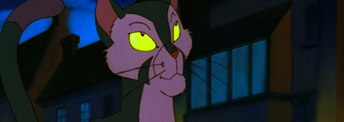
I really thought his eyes were endearing.
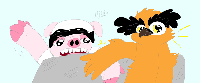
As for the final piece, I'm not entirely sure who these two are. I think they're youtubers, right?
I don't have too much to say here. The lines look nice and smooth, and I really like how the black crest on the owl came out. It's pretty well done cartoony art.
I think the recurring theme here is contrast, both in your colors and the textures you use. Try not to use too many soft brushes. Sometimes you want a sharp edge to parts of your work. Push the differences in your shadows and highlights. Don't be afraid to make the darks dark and the lights light.
Well, I hope you found this helpful. If any of this was confusing, let me know and I'll try to clear it up.